In praise of Japanese porn magazine design
Japan is often praised for its minimalist design aesthetic. This is then thrown to the wind (or rather, the dogs!) when you go to a love hotel and encounter garishness that makes Gaudí architecture look positively tame in comparison.
Similarly for web design, where Rakuten rules supreme despite its utter UX clusterfuck. If Amazon is like shopping in a modern supermarket, Rakuten is like walking unprepared into a medieval souk!
But this chaotic, garish design has its own kind of aesthetic, a craftsmanship that deserves respect and generates a certain culture. Now Rakuten and love hotels are as “Japanese” as MUJI and wabi-sabi.
The adult industry tends to fall somewhere in between. Tenga, of course, is famous for its sophisticated product design, an approach that also extends to the graphic design on its packaging and publicity, which is unobtrusive and stylish.
Tenga is something of an exception, though. In general, product boxes tend to feature illustrations rather than photos, and long titles and subtitles that lead the potential customer down linguistic rabbit holes. Images of the products are often placed against graphic backgrounds with labels and so on, as opposed to the more universal style of white backdrops to foreground the actual product.
Some product packaging has simple, clean design, but a lot of brands opt for crowded and messy designs, but this emphasis on bright colors and text has evolved into something iconic in its own right.
The box art of brands like Tama Toys, Toy’s Heart, or Nippori Gift is instantly recognizable. In fact, Tama Toys has attracted such a fandom for its illustrations and mascot character that this has spawned spin-off books.
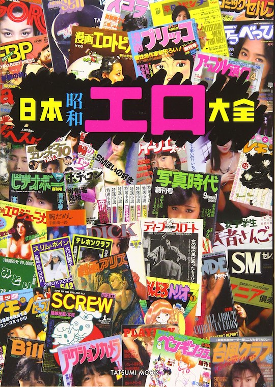
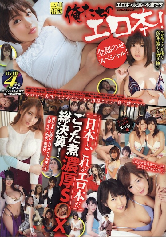
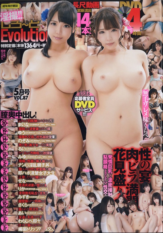
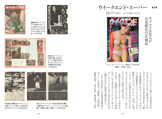
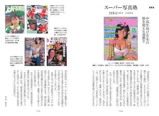
It is a similar situation with adult/porn magazines (エロ本 ero-hon, literally “erotic books,” but mostly referring to adult magazines or one-off “mook” booklets). Their serried ranks fill the racks of convenience stores, immediately visible by their “busy” and “messy” covers with provocative images and lots of text.
But this design takes real skill to accomplish. It’s not like Jackson Pollock is just haphazardly choosing the covers; every element is chosen to have a certain effect.
We were recently thinking about this as we looked at some of the books dedicated to this design subculture.
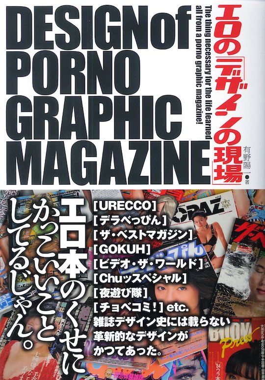
The Design of Porno Graphic Magazine (sic, Japanese title: エロのデザインの現場, literally “The Actual Site of Erotic Design”) is a book dedicated to graphic design in adult books and magazines in japan.
The tagline is, in somewhat awkward English, “the thing necessary for the life learned all from a porno graphic magazine!”
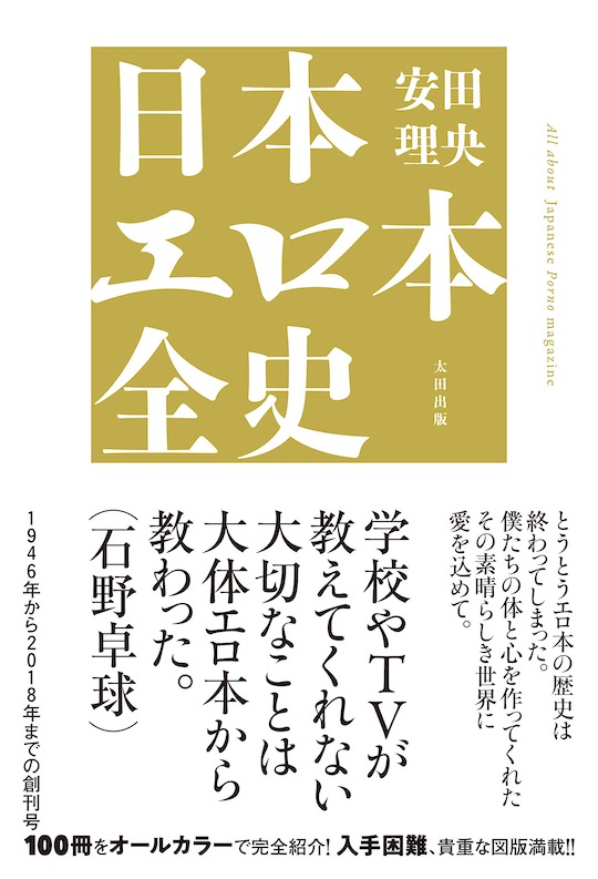
That book was first published in 2014. More recent (2019) is this Complete History of Japan Erotic Books, which introduces 100 magazines from 1964 to 2018.
There is an unavoidable element of nostalgia to all this, looking back to when magazine publishing was at its peak in the postwar period.
Another book, The Complete Japan Showa Erotic Books, which came out last year, specifically focuses on this Showa period of porn magazines in all their lurid glory.